Time series plotting using hvPlot
Default time series plotting
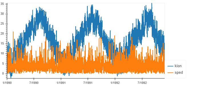
Suppose df is a pandas DataFrame having a time series index and columns of 'kion' and 'sped', which are actually a dataset of air temperature and wind speed at Chiba Observatory, Japan, provided by Japan Meteorological Agency.
import hvplot.pandas
df[['kion','sped']].hvplot()
Customized plotting
Now one column of 'kion' is selected for simplicity. Basically plotting can be customized by setting arguments of hvPlot, but some options originally from Bokeh cannot be customized. In that case, Bokeh's options can be customized by defining a function of hook(plot, element) as follows:
Definition of function hook
def hook(plot, element):
    plot.handles['xaxis'].axis_label_text_font_style = 'normal'
    plot.handles['yaxis'].axis_label_text_font_style = 'normal'
In this example, the function hook changes the text font style of labels in x-axis and y-axis to normal (default is slanted). The hook function is invoked by df['kion'].hvplot().opts(hooks=[hook]). Parameters in the function hook are defined in Bokeh.
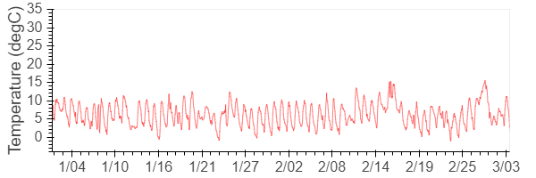
Customized time series plotting
The following is an example. xlim is x-axis range, xticks is the approximate number of major ticks in x-axis, ylabel is the title of y-axis, title is the title of the graph, width is the width of the figure in pixel, including legends, etc. (thus difficult to adjust the aspect ratio), height is the height of the figure in pixel, line_color is the line color, line_width is the line width, fontsize={'xticks':12, 'yticks': 12, 'ylabel':14} is the font size for each item in dictionary with items in keys and font sizes in values. In this example, x-axis label font size is 12pt, y-axis label font size is 12pt, and y-axis title font size is 14pt. The last .opts(hooks=[hook]) is to customized other options defined in Bokeh. The range xlim of time series index should be given in pandas.datetime().
df['kion'].hvplot(xlim=(pd.datetime(1991,1,2), pd.datetime(1991,3,4)),\
           xticks=10,\
           ylabel='Temperature (degC)', ylim=(-4,35), yticks=10,\
           width=600, height=200,\
           line_color='red', line_width=0.5,\
           fontsize={'xticks':12,'yticks':12 ,'ylabel':14},\
           title='').opts(hooks=[hook])